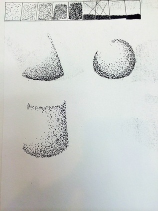
 I liked making these light to dark charts, because it helped with shading and highlighting in my actual projects that I have worked on. It just helps remind me of how I should go from dark to light in stippling, or charcoal drawings or other types of artwork. | 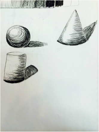 |
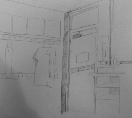
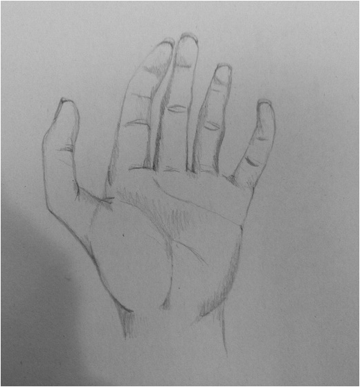
I enjoyed drawing the had and the room, because I got to add in detail and shadows to both pictures. Although I didn't get much time to make them look as realistic as I wanted them to look, I still had fun doing them and liked the whole concept of putting in as much detail as I could.
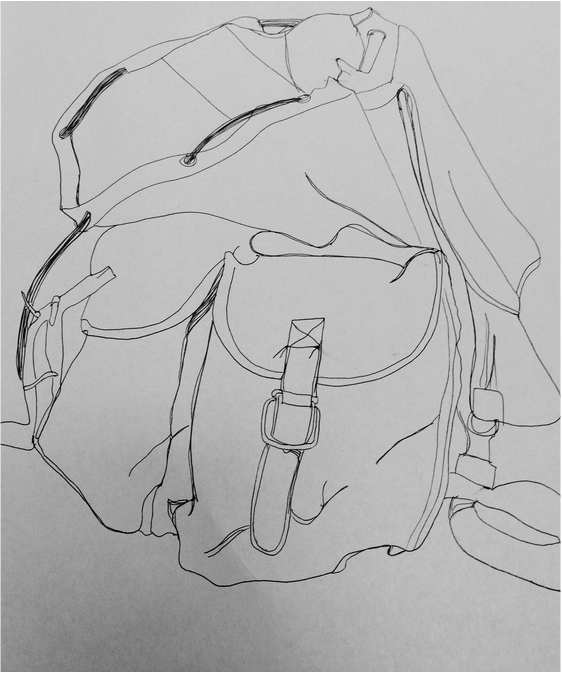
Drawing the backpack was a little hard to me in some parts, like the folds and wrinkles, but as i kept going and adding more of the details to it. I also had a hard time with the picture because I wanted to make it realistic and 3D By adding shadows to the backpack, but I wasn't sure of how to do it in this Project. Although I found it hard, I thought it came together much better that I hoped in the end.
Cloth and ribbon
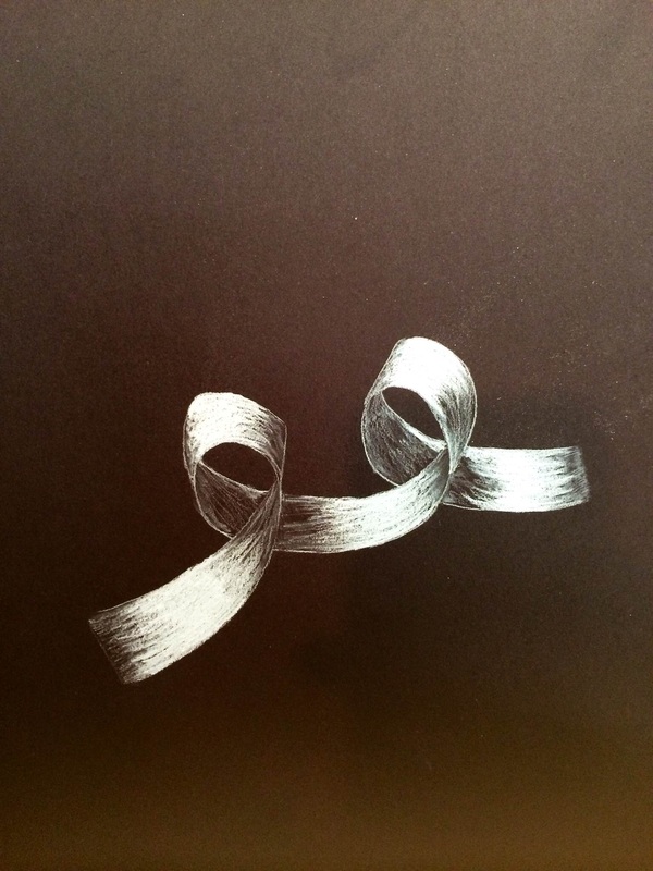
At first I thought it was going to be a little difficult drawing the ribbon, and putting the highlights in it, because I sometimes struggle with shadows and lighting, but I really enjoyed working on the ribbon. I found it a lot easier to draw on the black paper, because it pretty much gave the shadows in the ribbon naturally, so I only had to work on adding in the highlights. I was pretty happy with how it turned out.
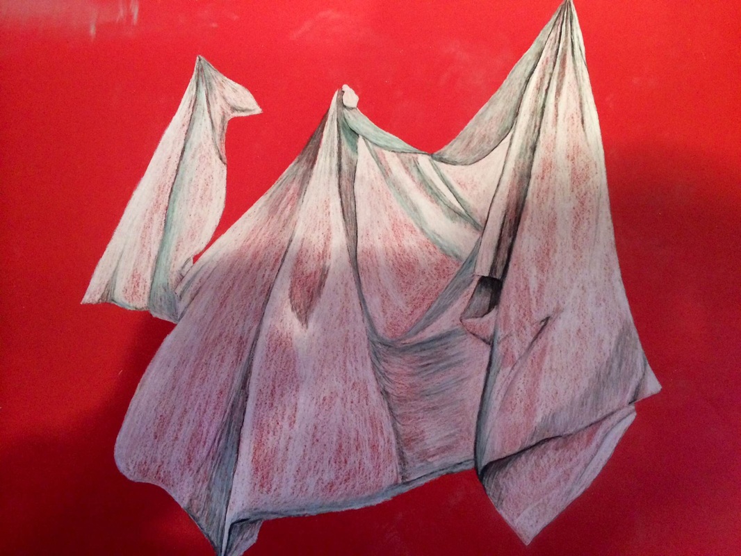
In this project I learned how to create folds, and shadows in fabric, to make the picture more flowing and realistic. I thought it was a little difficult to make the fabric look like there were folds and creases in it because I couldn't really get the shading right in some parts.
Progressive project
 |  |
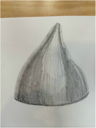 | 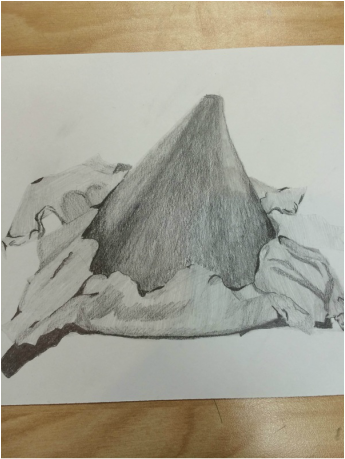 |
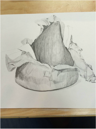
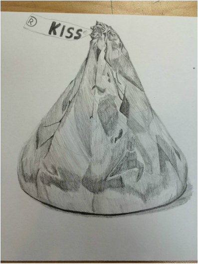
I found the Hershey Kiss project A little difficult, because of all the bends, folds, highlights, and shadows in the wrapper. It was had to me a first because I personally like to have every detail drawn in my artwork, so it took me forever to draw the first kiss, therefore not giving me enough time to finish the other three pictures. I wanted to make sure that I had the right folds, wrinkles, and the right shades to make it more realistic, which I succeeded in the first. The last three would have had more detail in them if I had had more time, but I was very pleased with my first one in the end.
Still life project
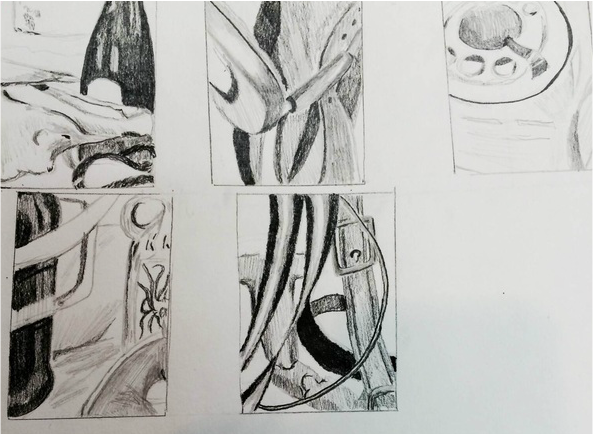
I decided on drawing the very last picture on here, because I really liked the horse bit in the background of the plant and bridle buckle. I wanted to pick one with a lot of metal material in it, because it had a lot of light shades of grey in it and since I usually have trouble when it comes to lighter colors next to each other. I also picked it because in the actual picture the buckle and bit have a lot of shine to them, and I wanted to practice drawing smooth surfaces.
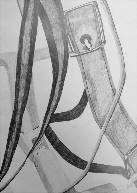
Again in this picture I didn't have as much time as I wanted, so some of it doesn't look how I would have liked it to, But I really enjoyed drawing the metal buckles on the halter. I also found it difficult with such a big picture to make the details more realistic, but I did spend most of my time in this working on the harder more light and darker parts. In the end I think it turned out good.
perspective
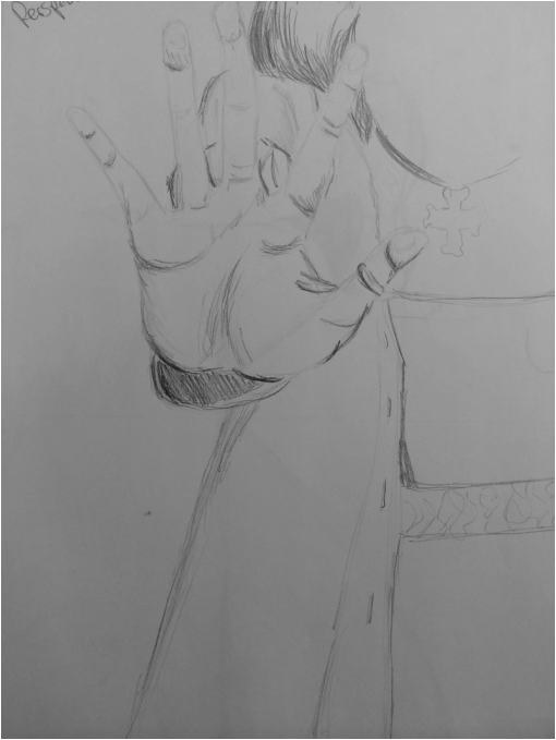
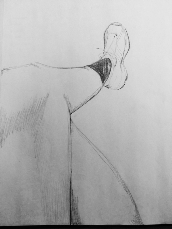
I really enjoyed learning, and practicing how to draw pictures in different perspective today. I really liked the first drawing I did of the had because I find that perspective very interesting to look at, because it is drawn to look as though someone is reaching out of the paper to grab something. That perspective was my favorite. I found the second picture ,looking down at objects, a bit more harder, because I think it is a more awkward point of view. Because you are looking down at the object, you are unable to see parts of the object that you are drawing because they disappear behind, or beneath bigger parts that stand out, causing the it too look strange to the eye. I just believe it is harder to understand, and connect what the picture is from a bird's point of view.
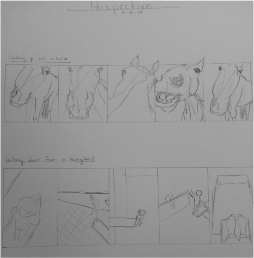
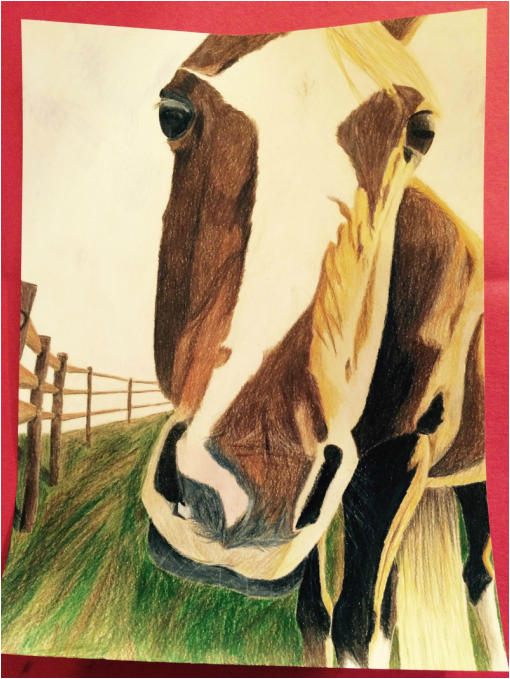
Today in class we had to come up with ten different ideas that we wanted to do for our next project, and then pick two from the ten. I decided on either drawing an ants perspective of a horse, or looking down on someone about to dive off a diving board. So I decided on drawing the horse, because I liked how the head looked bigger than the body, and because there were more details in the picture than the diving board one. I do think it will be somewhat of a challenge, because of the angles and making look like an actual horse rather than an awkward object, but I think it will be fun also.
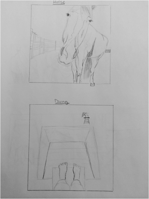
For the perspective project we were to pick two from the ten ideas and draw them bigger. I picked the two I thought would be challenging enough, but also easy so that I would be able to finish it . From the two pictures, I decided to do the picture of looking up at the horse, because I think it makes a cooler, interesting perspective that the other. I believe it will be a fun project to do. Below is a larger sketch of the picture I will be drawing for the perspective project.
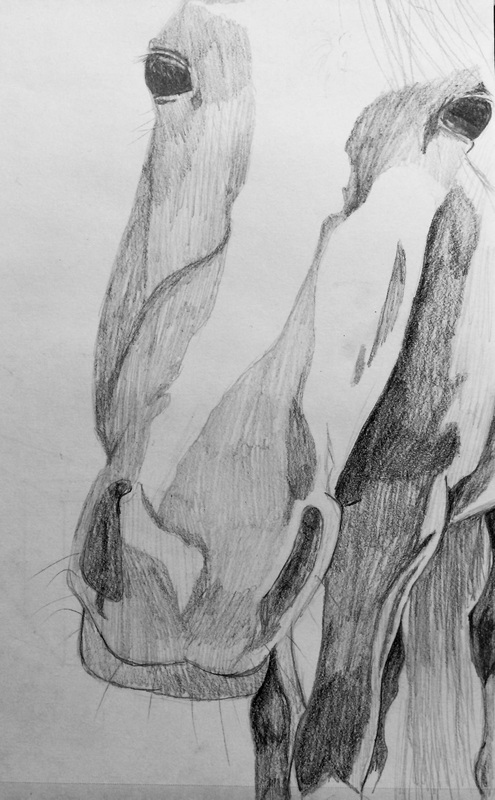
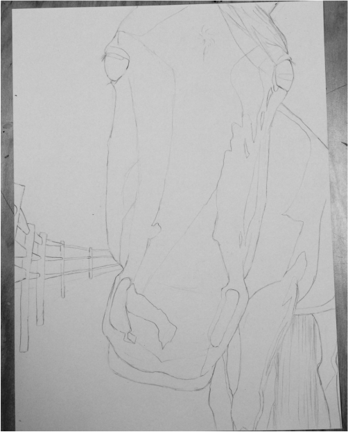
Today I started my point of view picture, I finished drawing the out line of the horse, background, and shadows. I decided on using prisma colored pencils, because I thought it would be a challenge for me, because I haven't worked with them much before. I do think that this project will be difficult for me, because there are so many different shades in the picture, so I will have to mix, and overlap a lot of different colors to create the real look. I also have to create a fur like texture in my picture, which I think will be difficult to do. I am excited to start this picture though, because I like having a lot of shadows and light patches on the object, because I like to practice with shading and lighting. I also made sure to do this piece on a smaller sheet of paper, because I never seem to finish on larger projects. Because it is smaller, I hopefully will be able to add all the details to it.
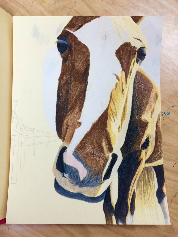
So far I think my biggest struggle in working with prisma colors is mixing the colors to create the right look, and the texture. But I think this project has helped me with using prisma colors.
This project was a little difficult to me because of the mixing of the colors and creating the right textures for the fur.
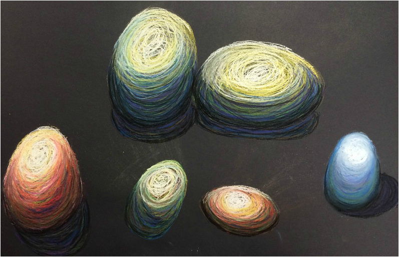
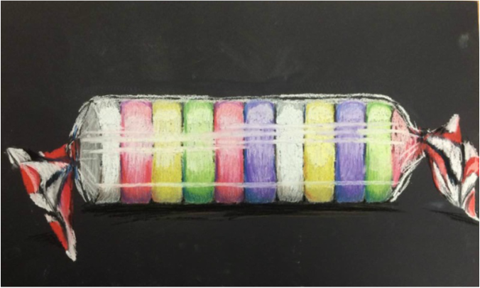
Today I learned different ways of using chalk pastels. I learned how to use different colors in the light and dark parts of an object. Using light colors like yellow, white, light blue, and light pink on the part that is being hit by light, and the darker colors, black, dark blue, purple and dark green for she shadow part. I also practiced different ways of mixing the colors together to make different textures like the line textured eggs and the smooth egg. I thought it was fun, and pretty easy using the chalk pastels.
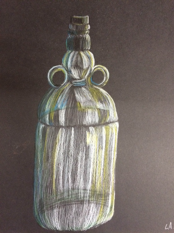
For this project we drew bottles using prisma colored pencils. Although I still feel like I don't really have the concept down of how to use them, I still enjoy practicing in these projects we do.
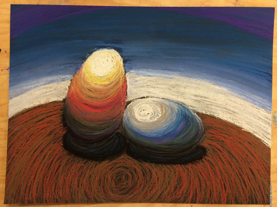
For this project we had to draw eggs with chalk pastels, using different colors and shades to make the light and dark areas pop. I enjoyed working on this project, because it was fun using all the chalk pastel colors in the picture and creating the smoothness of the eggs by shading all the colors together. The only problem I had while working on this picture was all the smearing. It was very easy to mess up the picture because of how easily the chalk smeared.
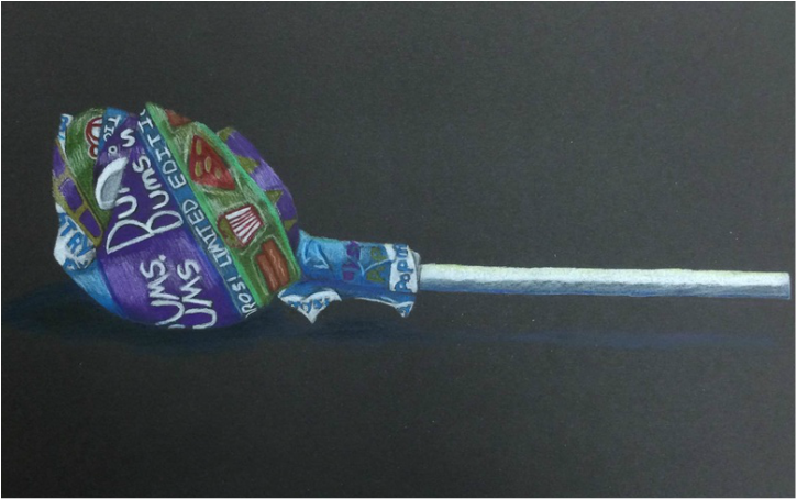
For this project we were to draw a lollipop using prisma colored pencils. I really enjoyed working on this picture, because it was fun to do, and helped with learning how to use prismas. My favorite part of this picture was using many colors and different shades of the same color in the wrapper to give the roundness look. I also liked how there were so many highlights on the wrapper and on the stick.
Opacity
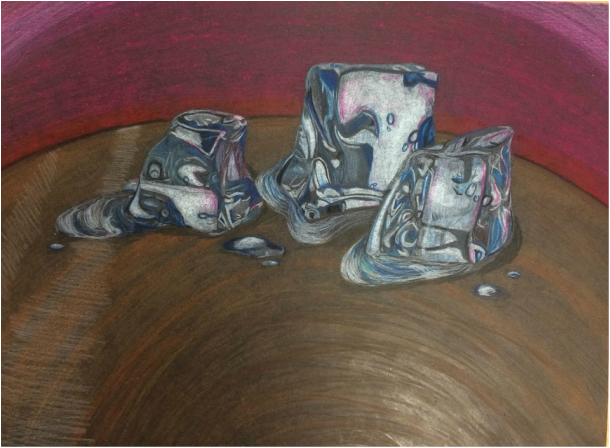
For this project we had to draw an object with opacity in it. I found this picture difficult to do because the ice had so many lines, highlights, and shadows in it.The melted part of the picture was also difficult, because it had many reflections in it and a lot of the ices reflected in it. At first I didn't like the way this picture turned out, because i thought the ice didn't look as realistic as I would have liked it to look, But I decided to to add in pink so that it looked like the wall was reflecting on it. In the end it turned out a lot better then I thought it would have. I also couldn't make the whites bright enough in the ice for where the light was hitting it.
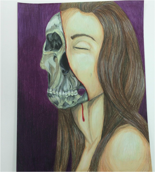
For this project we had to draw a picture of ourselves and also choose to do part mechanical, part zombi, or a mix. I really enjoyed this project, because it was fun, creative, and we got to use our own ideas and pictures to come up with our piece. I chose to use prisma colored pencils, because i could get more detail in the picture with it. I really loved working on the skull, even though it was a bit of a challenge, with all the different grays and yellows in it. It was fin to do and I think it turned out well for this only being my third time using prisma. I did have some trouble with the hair because the highlights and the way some of it was flowing. I believe the hair was definitely the hardest part, but it was good to practice with it in this project, because there was mostly hair. I also thought the skin turned out well I love the highlights and the different colors in the shadows. I really enjoyed this project and hope to get more practice with faces and hair in the future, so I can really master the realistic look.
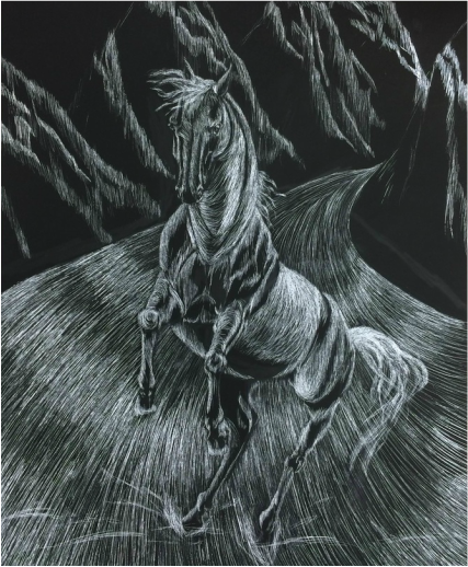
For this project we were to draw an object in or with motion on scratch boards. I found this project to be a little difficult, because it was hard to map out the drawing since we had to find the light areas only because the board was already black. It was also hard to control the different shades of light in the picture. The scratch board was also hard to use because you cannot erase on it, so any mistakes would be in the picture. I did enjoy this project also, because I didn't have to worry about the dark shading in it. I think it turned out nicely though in the end.
